The Evolution of CSS in Divi
Divi has long been renowned for its user-friendly interface and powerful design capabilities. With each iteration, Elegant Themes has pushed the boundaries of what’s possible in visual website building. Divi 5 represents a quantum leap forward in CSS integration, offering designers more granular control and creative freedom than ever before.
From Basic to Advanced: The CSS Journey
In earlier versions of Divi, CSS customization was primarily achieved through the theme customizer and basic inline styling options. While effective, these methods often required users to have a solid understanding of CSS to implement more complex designs. Divi 5 bridges this gap by introducing intuitive tools that make advanced CSS techniques accessible to users of all skill levels.
The Power of Visual CSS Editing
One of the most significant advancements in Divi 5 is the introduction of visual CSS editing tools. These allow designers to apply complex CSS properties and values through an intuitive interface, eliminating the need for manual code writing in many cases. This visual approach not only speeds up the design process but also makes it easier for non-coders to achieve professional-level results.
Responsive Design Made Simple
Responsive design has always been a cornerstone of Divi, but version 5 takes it to new heights. The enhanced CSS capabilities allow for more precise control over how elements behave across different screen sizes. Designers can now create truly fluid layouts that adapt seamlessly to any device, all without writing a single line of media query code.
Advanced Units: A Game-Changer for Precision Design
One of the most exciting features coming to Divi 5 is the introduction of Advanced Units. This innovative system replaces traditional unit fields and range sliders with a versatile, multi-functional component that supports a wide array of CSS units, value functions, and variables.
Expanding the Unit Palette
Divi 5’s Advanced Units field supports an extensive range of CSS units, giving designers unprecedented flexibility in specifying sizes, distances, and other measurements. From pixels and percentages to more specialized units like em, rem, vh, and vw, designers now have a full toolkit at their disposal to create pixel-perfect layouts.
Quick Unit Selection and Validation
To streamline the design process, Divi 5 introduces a unit quick selection feature. Commonly used units are readily available for rapid input, while a comprehensive unit picker provides suggestions for less frequently used options. This system is complemented by improved unit validation logic, ensuring that only valid CSS values are applied to your design.
Embracing CSS Value Functions
Perhaps the most powerful aspect of Advanced Units is its support for CSS value functions. Designers can now leverage calc(), clamp(), min(), and max() functions directly within Divi’s interface. This opens up a world of possibilities for creating dynamic, responsive designs that adapt fluidly to different screen sizes and content lengths.
The Power of CSS Variables
Divi 5 takes customization to the next level by supporting CSS variables (custom properties). These can be defined at the page or website level using Divi’s code fields, allowing for global style management and easy theme customization. This feature is particularly useful for creating consistent color schemes, typography, and spacing across an entire website.
Revolutionizing Typography with Fluid Scaling
Typography plays a crucial role in web design, and Divi 5 introduces powerful tools for creating fluid, responsive text that looks great on any device. The new Advanced Units system, combined with CSS value functions, enables designers to implement sophisticated typography scaling techniques with ease.
Implementing Fluid Typography
With Divi 5, creating fluid typography is as simple as using the clamp() function in your font size settings. For example, setting a title’s font size to clamp(2rem, 5vw, 4rem) ensures that the text remains readable across all screen sizes, scaling smoothly between a minimum of 2rem and a maximum of 4rem based on the viewport width.
Beyond Font Sizes: Fluid Line Heights and Letter Spacing
The fluid scaling capabilities in Divi 5 extend beyond just font sizes. Designers can apply similar techniques to line heights, letter spacing, and other typographic properties. This level of control allows for the creation of truly responsive designs where every aspect of the typography adapts harmoniously to the user’s device.
Custom Fonts and Variable Fonts Support
Divi 5 enhances its typography offerings with improved support for custom fonts and variable fonts. Designers can easily integrate unique typefaces into their projects, and take advantage of variable fonts’ ability to adjust weight, width, and other attributes dynamically based on screen size or user interaction.
Mastering Layouts with Flexbox and Grid
Divi 5 introduces robust support for modern CSS layout techniques, including enhanced Flexbox controls and the introduction of CSS Grid capabilities. These powerful tools allow designers to create complex, responsive layouts with minimal effort.
Flexbox Made Easy
While Flexbox has been a part of Divi for some time, version 5 brings a more intuitive interface for controlling Flexbox properties. Designers can easily adjust flex direction, alignment, justification, and other Flexbox properties through visual controls, making it simple to create flexible, responsive layouts.
Introducing CSS Grid Support
One of the most anticipated features in Divi 5 is the introduction of CSS Grid support. This powerful layout system allows for two-dimensional control over page elements, enabling designers to create complex grid-based layouts that were previously difficult or impossible to achieve with Divi.
Combining Flexbox and Grid for Ultimate Flexibility
Divi 5’s interface allows seamless switching between Flexbox and Grid layouts, even within the same container. This flexibility enables designers to leverage the strengths of both systems, creating truly unique and responsive designs that adapt perfectly to any screen size or content structure.
Custom CSS: Unleashing Your Creativity
While Divi 5 introduces many visual tools for CSS manipulation, it also provides enhanced capabilities for those who prefer to write custom CSS. The Custom CSS options in Divi 5 offer unparalleled flexibility for applying advanced styles directly to modules, sections, and entire pages.
Free-Form CSS: Your Canvas for Creativity
The Free-Form CSS area in Divi 5 allows designers to write unrestricted CSS code targeting specific elements. This feature is perfect for implementing complex animations, unique hover effects, or any custom styling that goes beyond Divi’s built-in options.
Module-Specific CSS Targeting
Divi 5 enhances its module-specific CSS capabilities, allowing designers to target individual elements within each module type. Whether you’re styling a button, tweaking image properties, or customizing form fields, Divi 5 provides granular control over every aspect of your design.
CSS Variables in Custom Code
The introduction of support for CSS variables also extends to the custom CSS areas. Designers can define and use variables within their custom code, making it easy to maintain consistent styling across the site and implement theme-wide changes with minimal effort.
Responsive Design Reimagined
Responsive design has always been a cornerstone of Divi, but version 5 takes it to new heights with advanced CSS techniques and intuitive controls. The enhanced responsive capabilities ensure that your designs look perfect on every device, from large desktop monitors to small mobile screens.
Breakpoint-Specific Styling
Divi 5 introduces more granular control over breakpoints, allowing designers to define custom CSS for specific screen sizes. This feature enables the creation of truly tailored experiences for different devices, ensuring optimal layout and readability across all platforms.
Responsive Images and Media
The advanced CSS capabilities in Divi 5 extend to image and media handling. Designers can now implement sophisticated responsive image techniques, such as art direction and resolution switching, directly through Divi’s interface. This ensures that users always receive the most appropriate image for their device and screen size.
Performance Optimization for Mobile
Divi 5’s CSS enhancements also focus on performance, particularly for mobile devices. The new system allows for more efficient CSS delivery, reducing file sizes and improving load times on slower connections. This optimization ensures that your responsive designs not only look great but also perform well on all devices.
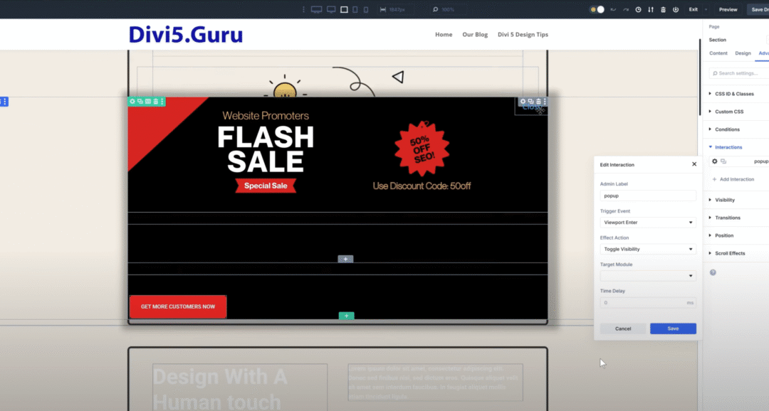
Animation and Interaction: Bringing Designs to Life
Divi 5 elevates its animation and interaction capabilities, leveraging advanced CSS techniques to create engaging, dynamic user experiences. From subtle hover effects to complex scroll-triggered animations, Divi 5 provides the tools to bring your designs to life.
CSS Transitions and Animations Made Easy
The new CSS tools in Divi 5 make it simple to implement smooth transitions and complex animations. Designers can easily apply CSS transitions to various element properties, creating subtle yet effective interactions that enhance the user experience.
Scroll-Triggered Effects
Divi 5 introduces intuitive controls for creating scroll-triggered animations and effects. Using a combination of CSS properties and Divi’s built-in animation system, designers can create engaging parallax effects, reveal animations, and other dynamic elements that respond to user scrolling.
Interactive Hover States
Creating engaging hover effects is easier than ever with Divi 5’s enhanced CSS capabilities. Designers can apply complex transformations, color changes, and other effects to elements on hover, all through an intuitive visual interface.
Accessibility and Inclusivity Through CSS
Divi 5 places a strong emphasis on accessibility, leveraging advanced CSS techniques to ensure that websites are usable by all visitors, regardless of their abilities or assistive technologies.
High Contrast and Color Accessibility
The enhanced CSS controls in Divi 5 make it easy to implement high-contrast modes and ensure sufficient color contrast for improved readability. Designers can easily switch between different color schemes to accommodate various visual needs.
Focus Styles and Keyboard Navigation
Divi 5 introduces improved CSS controls for focus styles and keyboard navigation indicators. This ensures that users navigating your site with a keyboard or other assistive devices can easily understand their current position and interact with all elements effectively.
Screen Reader-Friendly CSS
The advanced CSS capabilities in Divi 5 extend to creating screen reader-friendly layouts. Designers can easily implement proper heading structures, skip links, and other accessibility features using Divi’s intuitive interface and custom CSS options.
Performance Optimization Through CSS
Divi 5’s advanced CSS capabilities aren’t just about aesthetics; they also play a crucial role in optimizing website performance. The new system introduces several features that help reduce CSS file sizes, minimize render-blocking resources, and improve overall load times.
CSS Minification and Optimization
Divi 5 automatically optimizes and minifies CSS output, reducing file sizes and improving load times. The system intelligently combines and compresses CSS rules, ensuring that only the necessary styles are loaded for each page.
Critical CSS Generation
One of the most exciting performance features in Divi 5 is its ability to automatically generate and inline critical CSS. This technique ensures that above-the-fold content renders quickly, significantly improving perceived load times and user experience.
Lazy Loading CSS
Divi 5 introduces sophisticated lazy loading techniques for CSS, ensuring that non-critical styles are loaded only when needed. This approach significantly reduces initial page load times, especially on mobile devices or slower connections.
Compatibility and Integration
As web design evolves, compatibility with existing systems and integration with new technologies become increasingly important. Divi 5’s advanced CSS capabilities are designed with both backward compatibility and future extensibility in mind.
Seamless Upgrades from Previous Versions
Divi 5 ensures smooth transitions for existing Divi users. The new CSS features are designed to work seamlessly with layouts and styles created in previous versions, allowing designers to upgrade their sites without fear of breaking existing designs.
Third-Party Plugin Compatibility
The enhanced CSS system in Divi 5 is built with extensibility in mind. It provides robust hooks and filters that allow third-party plugin developers to integrate their own CSS controls and features seamlessly into the Divi interface.
Future-Proofing with Modern CSS
By embracing modern CSS techniques and properties, Divi 5 ensures that websites built with it will remain compatible with future web standards. The system is designed to easily accommodate new CSS features as they become available, keeping your designs cutting-edge for years to come.
In conclusion, Divi 5’s advanced CSS capabilities represent a significant leap forward in visual website building. By combining intuitive controls with powerful CSS features, Divi 5 empowers designers of all skill levels to create stunning, responsive, and highly optimized websites. As we look to the future of web design, it’s clear that Divi 5 is poised to play a pivotal role in shaping the next generation of beautiful, functional, and accessible websites.
0 Comments
Trackbacks/Pingbacks