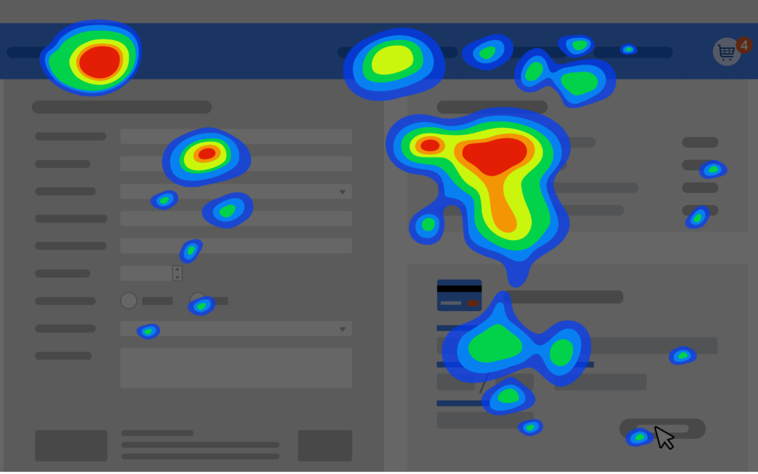
Introduction to Heat Maps
A heat map is a tool that demonstrates how client-side users interact with a website. Similar to A/B tests, which were discussed in a previous blog post, heat maps are one tool to help a company increase conversion rates. A heat map measures activity from blue to green to red. A website with a heat index of red is viewed by the vast majority of visitors to a website. Meanwhile, a website’s content, whose index is dark blue, is viewed or interacted with by a small minority of the website’s traffic. A heat index of green indicates that around 50% of the website’s traffic views or interacts with that content.
A heat map provides data about what parts of a website page are being used and interacted with and where users drop off and stop interacting with a website page’s features. Visitors are generally less likely to view a page’s content the lower down the page it is. For example, a visitor is less likely to complete a form if it is too complicated and has too many form fields.
A heat map provides data that helps an e-commerce store improve its checkout process so customers are more likely to complete the process instead of leaving it before purchasing.
Types of heat maps
There are three main types of heat maps:
- Scroll maps – These heat maps track the percentage of visitors who scroll down to specific points on a webpage. These identify areas on a website with high engagement or interaction. These parts of a website are also known as hotspots. Usually, the “hottest” areas of websites are at the top of the website.
- Click heat maps(touch maps on mobile devices) – These heat maps track where client-side users click or tap on a webpage. Click or touch heat maps can determine the following:
- The webpage elements visitors are responding to or interacting with.
- How effective CTAs(call to action) are.
- If further A/B testing is necessary.
- Hover heat maps – These heat maps track mouse movements across a page. Hover maps can help you determine:
-
The elements visitors are paying attention to or interacting with
-
Whether visitors are becoming distracted by unimportant page details
-
If visitors are struggling with the webpage’s content(i.e the UI/UX needs improvement)
-
Interpreting a heat map
What can a heat map tell us? Generally, content that a web site’s owner wants visitors to view or interact with should be as high up the website as possible. For example, forms that a website owner’s want’s visitors to fill out to sign up for an email list or indicate interest in a company’s products or services should be located at or near the top of the page. Other content vital for visitors to see or interact with should be as near the top of the page as possible. This could include promotions for products or services the company offers or showcasing products that a visitor might be interested in. It’s fine if visitors leave a webpage before reaching the footer, which generally contains links to other web pages that most visitors wouldn’t be interested in.
What if a website has too much dark blue? This indicates that the website is too cluttered, and visitors are simply not interacting with much of the website’s content. In other words, a webpage is too crowded and needs more white space. A heat map could inform how much-qualified traffic a website receives. Qualified traffic is website traffic consisting of site visitors who are ready to make a purchase. A lack of qualified traffic could be indicated by a lot of blue and green on the website’s checkout pages.
Additionally, a heat map could indicate the lack of conversions to a business. A heat map could explain why a website’s CTA(Call to action) isn’t receiving the desired attention. Furthermore, a lot of blue on a form could indicate reasons for the lack of conversions. A lot of red on a website could indicate great UI/UX design, increasing a company’s brand loyalty.
To view that blog post or learn more about digital marketing, SEO, Divi, or other related topics, visit our website’s blog section. Fill out our contact form now to contact us and get a FREE analysis of your website.

