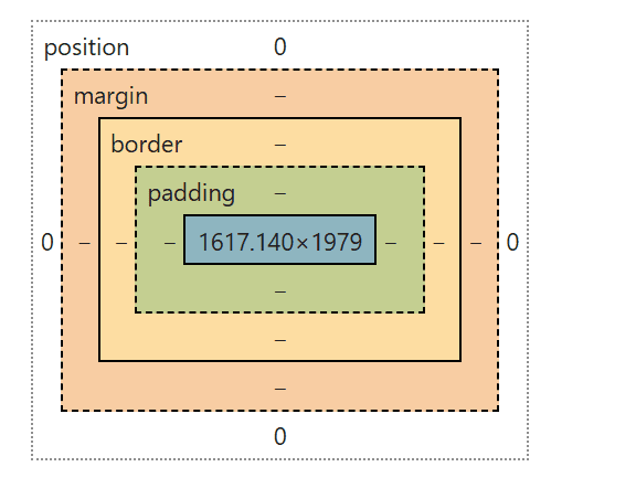
Spacing using CSS is an essential aspect of designing any website. Proper spacing enhances the readability of elements displayed on the screen and makes the overall layout more visually appealing. To illustrate this concept, let’s take a closer look at the image referenced above. This image can be accessed in the computed values tab of the elements section when you inspect a website by right-clicking on it. In school, breaking down a complex problem often leads to finding a solution. For example, when analyzing the properties of a thermodynamic system, one must consider various factors. However, delving into that topic is beyond the scope of this blog article.
The light blue square in the image represents the content that is displayed on a webpage. It is important to note that every element on a webpage is contained within its own container. This means that the layout of a webpage is structured in a way that each piece of content has a defined space. When we add padding, represented in green in the image, it increases the distance between the content and its border. This padding creates a buffer zone that enhances the visual separation between the content and the edge of its container. The border of an element marks the outer edge of that element’s container, providing a clear boundary.
Many people who are learning CSS often confuse padding with margin, but it is crucial to understand that they are not the same. Padding is about the space inside the element’s border, while margin refers to the space outside the element’s border. Margin does not alter the size of an element’s container; instead, it defines the distance between the containers of adjacent elements. This distinction is vital for creating a well-structured layout.
Positioning is another important concept in CSS. It refers to how an element is placed within the overall layout of the website. The position of an element can be categorized in several ways: relative, sticky, static, fixed, inherit, initial, or absolute. Each of these positioning types serves a different purpose and can significantly affect how elements interact with one another on the page. In popular WordPress theme builders, such as DIVI, the position of elements is rarely changed from its default settings. This is often because the default settings are designed to create a balanced and user-friendly layout.
In many tutorial courses on CSS, I have noticed that the concepts of sticky, static, fixed, inherit, or initial positioning are seldom covered in depth. Instead, these tutorials tend to focus on relative positioning, which is a fundamental concept. Relative positioning allows child elements to be positioned in relation to their parent element. A child element is defined as an element that is nested within another element’s HTML tags. This relationship is crucial for creating a hierarchy in the layout and ensuring that elements are displayed in a logical order.
Understanding these concepts of spacing, padding, margin, and positioning is essential for anyone looking to create a visually appealing and functional website. By mastering these elements, you can enhance the user experience and ensure that your website is not only attractive but also easy to navigate.
In conclusion, spacing in CSS is not just about aesthetics; it plays a critical role in how users interact with your website. By carefully considering the use of padding and margin, as well as the positioning of elements, you can create a layout that is both visually pleasing and user-friendly. As you continue to learn and experiment with CSS, keep these principles in mind to improve your web design skills.
This is a parent element.
This is a child element.
.class1 {
position: relative;
padding: 10px;
margin: 15px;
height: 300px;
border: 2px solid black;
}
.childClass1 {
position: absolute:
top: 20px;
right: 15px;
padding: 10px;
border: 2px dotted red;
}
If you want to learn more about optimizing your online presence, including through Google ad groups, fill out our contact form now to contact us. We offer a FREE website analysis, which can provide valuable insights into your current marketing strategies. Additionally, if you want to explore more blog posts related to SEO, Divi, CSS, HTML, WordPress, WordPress plugins, digital marketing, computer science topics, or other related subjects, visit our website’s blog section.

0 Comments